
Key Takeaways:
- RSAC is open sourcing Quantickle, a custom graph toolkit designed for independent analysts and researchers.
- Built by a non-programmer using AI assistance, this project proves that "vibe-coding" can produce valuable security tools in a fraction of usual development time.
- The toolkit is available now via RSAC-Labson GitHub.
For some time, I have wanted a simple, browser-based network graphing tool that could truly handle the complexities of threat research. This is the reality of threat intelligence: while some data is standardized, the most critical leads are often 'weird and off-the-wall'. These one-to-many relationships are exactly where Excel fails, yet they are where graphs excel. Because existing commercial software is often too rigid to allow for major changes or true customization, I was left with a gap in my toolkit. So, I set out to build the solution myself.
But I am not a programmer.
Oh, I do quite a bit of scripting and local tool creation, but production code? No, not going there. I am an analyst and reverse engineer and have reconciled myself to that fate. I’m going down with the disassembler.
Sometimes I am frustrated by this shortcoming, because it means that if I want tools to make my day easier, I either have to buy them off the shelf or ask someone to make them for me, and usually neither gets me exactly what I want.
Until now. Until vibe coding.
AI-assisted development, also known as “vibe-coding” or “vibing” has been the target of much ridicule. Swarms of confused developers have taken their LLM-driven problems to social media, and social media has done what it does best: Responded with scorn. An area that used to be reserved for skilled engineers saw an influx of novices, boosted by services that many still consider a techno bubble. There were examples of AI tools breaking working code, introducing ugly vulnerabilities and even wiping entire drives. It appeared to be, as an AI told me the other day, “a complete zoo”.
So I decided to join in.
My initial try was modest. Baby steps. I told the LLM what I wanted. It gave me some paste able code. And to my surprise, it worked. Within all of 30 minutes, max. All right, it was just a basic graph tool that took CSV files and displayed them as nodes and edges, but it was miles better than anything I had made before.
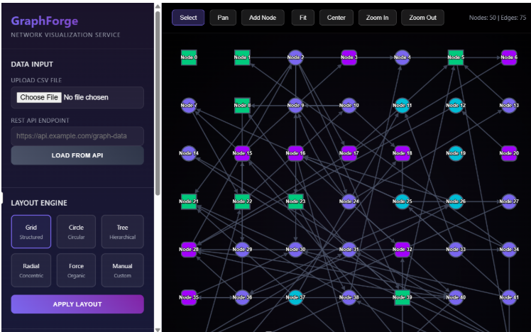
Above: The first attempt
Over the course of a few months and multiple LLM models, the project evolved. The process was quite interesting, even if it involved a lot of shouting at the screen.

Above: Me losing patience after the LLM for the third time confidently declared that the error occurred because a file was missing. The file was not missing.
However, eventually the project changed into something that can be helpful for other people. And so we’re publishing it.
Is it production quality? I doubt it. But it works. And we’re not selling it; we’re giving it away.
RSAC is all about community, and going forward it is my hope that we’ll be able to give back to the cybersecurity and technology communities that have contributed so much to us and others over the years.
As of this publication, Quantickle is available from the RSAC-Labs organization on Github. It’s licensed using a friendly Open-Source license, so fork it and do what you want with it. If you just want to use it out of the box, that’s great too. It’s a very easy installation and supported on most desktop platforms.
With Quantickle, You Can Visualize Any Type of Relationship
Relationships. Any relationships. See, illustrate and annotate how things are connected. It is built with a cybersecurity slant, but it is deliberately made easily extendable to any research area, from biology to software to OSINT. The base graphics engine is Cytoscape, an open-source project originally developed for the biological sciences; but it adapts nicely to any relationship model.
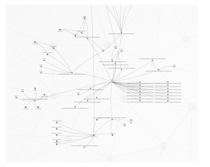
Above: A typical Quantickle graph. Domains, IP addresses and malware hashes.
This tool is not made for the enterprise. There are already software products that cover that space, and their makers can provide much better support and maintenance than I ever could. Quantickle is a different beast. Its purpose is to facilitate manual research, not automation; and to make detailed, customizable illustrations for visualization and publication. It aims at high-quality, curated relationships, and not massive hairball clusters.
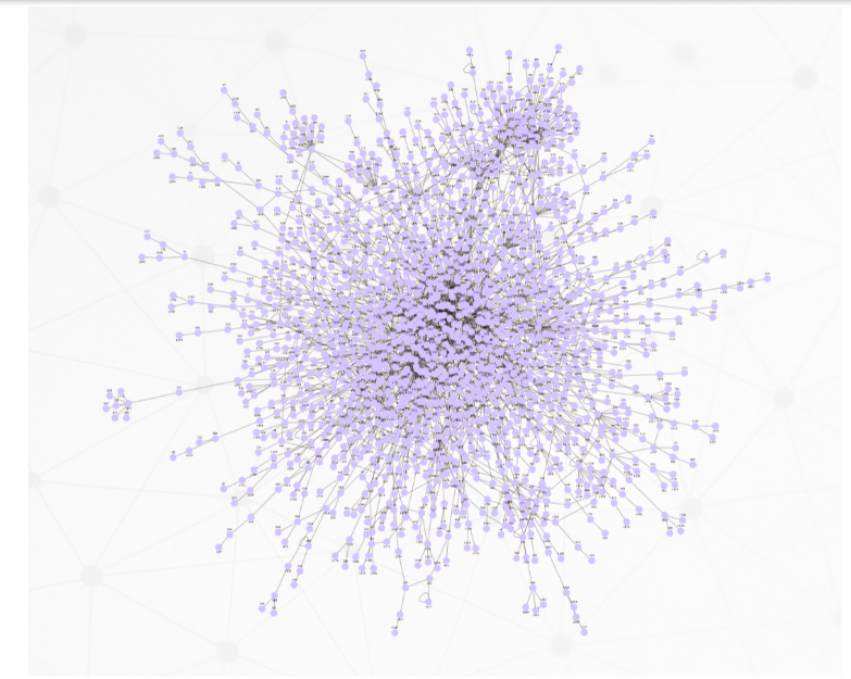
Above: Quantickle can make large clusters if pressed but gets sluggish if you throw a lot of data at it, like in this 2000-node graph.
Containers
A concept I came across almost by accident was the Cytoscape “compound nodes” which in graphs became containers. Not to be confused with the software packaging, Quantickle containers are nodes that contain other nodes. And since containers are nodes, containers can contain other containers and infinitum.
The need for these arose because I wanted a way to group data together without connectors or edges between them. For example, if you have a cluster of ransomware files, it could be useful to put them all in a common box even if they are wholly unrelated.
Containers turned out to be useful in other settings as well, as they evolved into sub-desktops – areas of the graph with individual layouts, styling and backgrounds.
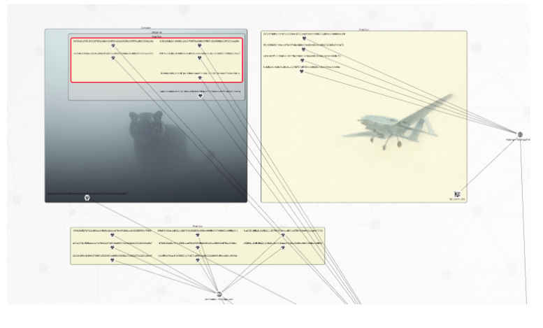
Above: Containers with different styling enclosing parts of the graph.
Interlinked graphs
You can only show so much data onscreen, but you can get around that limitation by linking graphs together in navigable chains. Hence, you don’t need to build graphs with 5000 nodes. Instead, you can have ten graphs with hundreds of nodes and jump seamlessly from one to the next. You can also use these links to create tree structures— graphs of graphs.
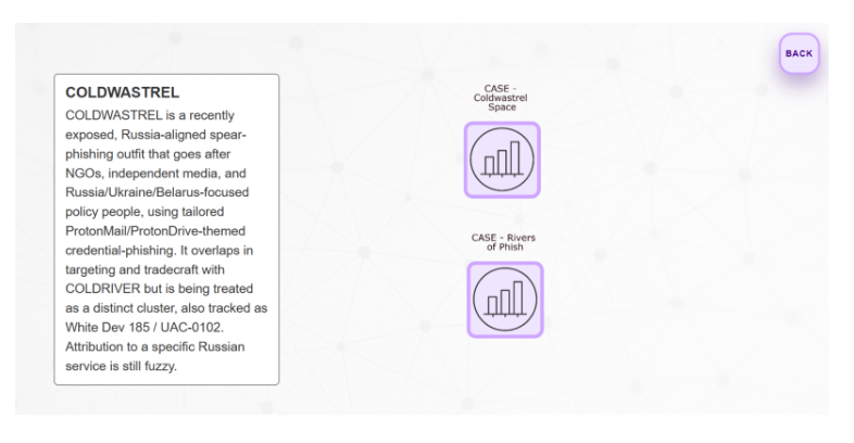
Above: A graph dashboard for the threat actor “Coldwastrel”, with links to cases involving it. Double click into next graph, click “back” to revert. The text box is a special callout node - these can be added anywhere to add context.
Temporal relationships
Traditional graph tools tend to be sub-par when it comes to illustrating time-based data. However, timing can be an important factor in research. You may not want data that is too old. You may investigate activity that is limited to a time window, while there’s other, unrelated activity outside of that window. Thus, as they say, time is of the essence.
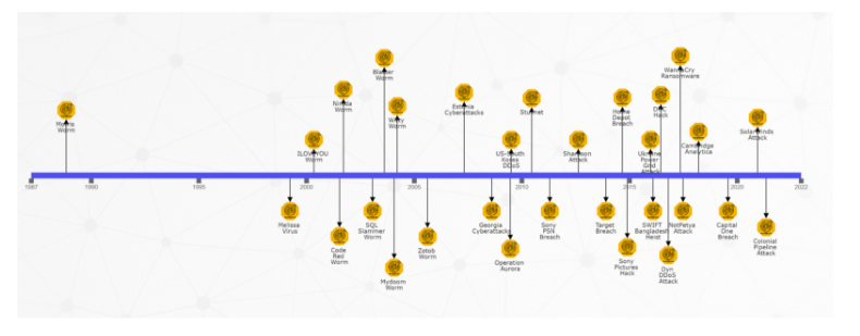
All Quantickle nodes come with an optional timestamp, and there are multiple layouts that use that timestamp, including a classical timeline.
Above: A timeline of cyber events
Time is also possible to illustrate using color; and you can toggle this on and off. The example below illustrates a large-scale phishing campaign in Australia, with the phishing domains colored based on their creation date. If you investigate such a campaign you might want to focus on the most recent activity, and the color coding makes that easy.
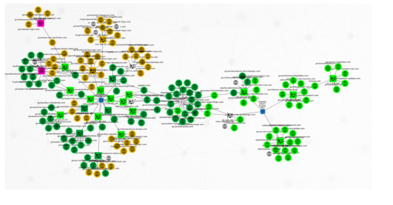
Above: Temporal visualization. The phishing domains in this graph change color based on how recently they were created – bright green are less than two months old.
Data import and export
You can import data in several ways. The easiest is perhaps to paste IOC’s on the desktop; these will become nodes that can be edited afterwards. However, if you want to import full graph relationships, then the recommended method is using CSV files.
The graphs themselves are just JSON, and they can be saved to local files or to Neo4j database (if you have that installed).
The visualizations are exportable as CSV, PNG, PDF or HTML files.
Final words
As mentioned, the project is available from RSAC’s public GitHub at
https://github.com/RSAC-Labs/Quantickle
In order to use it, you need to install Git and Node.js, both of which are straightforward install jobs supported on most platforms.
Privacy wise, data stays local by default. Quantickle is mainly client-side JavaScript with a small server side backend, and if you’re just using it for analysis and graph building, it should not leak data. However, there are third party service integrations available (most importantly VirusTotal), and using these will naturally expose data externally. However, external communication is manually triggered, so you should be able to easily prevent any sensitive data leakage.
I would be happy if people found this tool useful, and I expect that many will want to modify it to fit their own workflow and data sources. You should be able to adapt and automate it easily; I’ll be very interested to see what you do with it!
PS: Over the course of this project, I have tried pretty much all the major AI models and UI solutions. They have different strengths and weaknesses - if people want to use AI-assisted coding to further this project, they should try and see which solutionworks best for them.